Anyone who uses and/or enjoys wood type should make at least one trip to Two Rivers, Wisconsin, to the Hamilton Wood Type & Printing Museum. At around the turn of the last century, they became the largest wood type manufacturer in America (the world?), and continued to produce wood type until 1984.
After reading the history, I can imagine that Edward Hamilton took on the production of wood type as a challenge to come up with the most efficient methods to manufacture the type (though I may be a tad type-focused - I am sure there were many opportunities for innovative thinkers and tinkerers in the pre/post Civil War Midwest, when everything was booming). When he first started out making wood type in a back room in his mother's house, he opted for an inexpensive method, but as he built a customer base, expanded and absorbed other type companies, he switched to cutting type out of sturdier material (maple instead of the holly wood letters mounted on pine blocks that Hamilton produced originally – I wonder if there was any correlation between the type of wood that was available around Two Rivers and Hamilton's choice of materials) and created methods of production, including unique machinery, to more efficiently produce the wood blocks.
Touring the museum’s display of how type was produced is awesome. The machinery is big and heavy-looking, and I imagine it was quite noisy and hot and sawdust-y when it was running, planing and sanding and cutting (and punching) blocks to be carved into type. And before the factory was electrified, all of machinery was originally run from one steam engine -- the machinery was attached to really large rotors (I guess?) that spanned the factory floor (at the ceiling level) by such things as canvas bands, and when the bands were engaged with the rotors, the machinery ran.
Hamilton went on to also produce type cabinets, office furniture, steel furnishings for medical/dental offices and laboratories, the first clothes dryer, among many other things. These days, the focus of the company is laboratory furnishings, I believe (mainly using steel for fabrication, instead of wood).
And then there’s the wood type. It is a visual and tactile pleasure palace, if that’s your thing. Fortunately, if you have the skills (to use the type) and the time to do it, you can get your hands all over a lot of stuff that you’ve never seen before in person, and may never see again. It is a living museum, meaning printers can keep the history and type alive by using it. Photographs will never do it justice (though I continue to try!), only ink does, and it would take quite a while to exhaust the collections at the museum expressing their full beauty on paper.
Check out this flickr group: http://www.flickr.com/groups/hamiltonwoodtypemuseum/
Join the fan club on Facebook: http://www.facebook.com/group.php?gid=91084745476&ref=mf
Monday, April 20, 2009
Sunday, March 15, 2009
Found design is always a delight. These signs are posted at some of the parks around Chicago, and though they look recently produced (not much wear from the weather, no rust, etc.), I believe the design is old, though I don't know.
Check out the dog, the leash, and the flower! It seems stylized in the right way to have come out of the early part of the last century, doesn't it?
I wonder who decided that a scrawny scotty was the way to go.
This is definitely one I'd like to have on the wall in my work-room.
Seeing it reminds me to look for the interesting/beautiful in the everyday, and of course to look for more cool signs!
Saturday, February 21, 2009
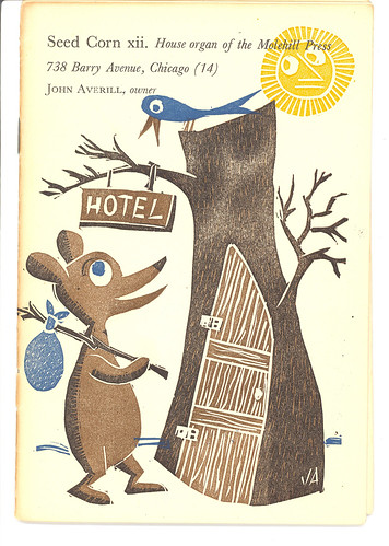
John Averill, Graphic Designer
At a book sale last summer, I came across a selection of these small pamphlets that had obviously been letterpress printed.
Of course, I had no idea who John Averill was, but I could tell from the artwork and the typesetting and the funny vignettes that a lot of time went into these pamphlets, and the quality of the design made it impossible to leave without one. Now, I wish I had picked them all up!
I haven't found much information about him, but it appears that he was a graphic designer in the 1950s, and he created these pamphlets to promote his work. He would mail them out to agencies, follow up with a call (or sometimes be called), and that could lead to work designing ad artwork, etc.
Today's Inspiration (a blog about illustration from the 1940s and 1950s -- zowie!) has a nice profile of John Averill, with some good photos of various pieces of his work, including some ads for 7Up.
Saturday, February 14, 2009
See's Candies
Maybe it’s because I am from California and there are few things from the state that are not a bit more different every year than what I remember them to be*, but I truly enjoy every single aspect of See’s Candies except one: the moment I have eaten the last one.
Whenever my mother had to run errands, she promised me and my brother a See’s lollipop if we were good. I recall the brightness of the shop, with its black and white tile floor and all white walls; it was the brightest shop in the shopping mall, where the dark colors of the 1970s and muted lighting dominated. [I also remember the uniquely shaped exterior of another now-defunct California retailer, Bullock’s – its brown brick walls moved skyward at non-perpendicular angles to the earth, forming trapezoidal mountains in my five year old mind that I could just walk up if I so desired.]
The lollipops are the tastiest pieces of hard candy I have ever had, but it’s really the chocolates that to me are the best in the world. They haven’t changed their recipes since I have been eating them, and if my parents’ enjoyment of them is any sign, they haven’t altered their recipes for at least two generations. They are chocolates that taste better than if you made them at home: there is no ingredient that is compromised, and they take all the time they need to make them, and they’ve been doing it for nearly a century (their first store opened in 1921, according to their web site).
Of course, the branding and packaging is the beginning and ending. Whenever I catch a glimpse of ad artwork, no matter where it is, that seems to be just black and white, See’s immediately comes to mind. Their artwork looks original and unchanged, so when I receive a box of chocolates, I feel I have received a bit of home that hasn’t changed and that I am guaranteed the same quality chocolate I have had my whole life. When I have savored every bit-there’s always an end to a box of chocolates, no matter how hard I try to make it last!-the box is there to remind me that hopefully in a little bit there will be another box, just as good. If the artwork’s the same, I know the chocolates will be.
*That’s a sign of getting older, isn’t it, when you recall everything used to be different (usually meaning better) in the past than it is now?
Sunday, February 8, 2009
Hendrick Nicolaas Werkman
I discovered a monograph (see end for info) in a local used bookstore, and knew right away that I wanted to know more about this fellow and his work. How could I not? Within the practical lifetime of printing (when presses were still necessary tools, unlike today), he was trying different ways of using them and the accessories-the type, the ink, the paper-to create art that communicated to anyone who would look at it.
Dutch printer/artist/revolutionary working ~1920 to 1945 when he was executed by the Nazis.
He lived and worked in Groningen, and did not travel much (he was but a poor printer), so his exposure to the outside world(s) of art and thought were mainly from correspondence with fellow artists in other cities and the various periodicals he collected from around the world and was involved with (as a printer and contributor); later in his career, some of the projects that he printed-and was asked to print but decided not to-(the Nazis controlled everything and quashed anything that was not pro-German or at least not overtly and obviously anti-German) were a source of new ideas but also anxiety, as Werkman worried about his actions harming innocent neighbors. He ran his print shop in a building that had other tenants. Some of those projects included 20 prints for portfolios of Hasidic legends, and a somewhat sporadic periodical called Die Blauwe Schuit (The Blue Barge) that contained poetry, writings and artwork to boost the Dutch spirit during the German occupation.
Werkman belonged to de Ploeg, a Groninger artist collective, but seemed regularly at odds with them. They considered him, a printer, a lesser artist and he thought they were too unbending in seeking out new ways to communicate their ideas, and perhaps he found them to be smaller thinkers since they refused to be open to pushing forward and broadening their consideration of what could be categorized as art and making art. He worked within the collective to try to bring about some opening of the minds of his fellow de Ploeg members and some of them appreciated his work, but by and large they considered him minor.
For Werkman, the Constructivists were too rigid and narrow minded (which is where the de Ploeg members fell). And the Dadaists were too frivolous and treated their work as too trivial.
Werkman worked organically, creating on the press as he went: “The subject proclaims itself and is never sought.”
He printed publications for de Ploeg, as well as other art collectives, and in order to push the boundaries of the definitions of printing and art produced his own periodical, called The Next Call, that are color saturated feasts for the eyes. The narrative was minimal, mainly in support of his manifesto to go boldly forward in the making of art including poetry, though there are some phrases that stuck with me:
EEN RIL DOORKLIEFT (a chill permeates)
HET LIJF DAT VREEST (the body that fears)
DE VRIJHEID VAN DE GEEST (the freedom of the soul)
[Both for how they appear in the original language, but also for their poetry.]
[Both for how they appear in the original language, but also for their poetry.]
In addition to using a press, ink, rollers and type to create his own periodical, he also used stencils that he made to create figures and abstract forms with ink on the press. He called his monotypes druksels (concocted from the Dutch infinitive drukken, to print), and he also used a typewriter to create tiksels (tikken, to type). He also produced calendars and artworks to illustrate poems and stories.
He is inspiring for his obvious pure delight in pursuing his art, his creativity and use of type and color and shape, and his undiminished enthusiasm for connecting with others in the art world and beyond, his willingness to carry on in the face of oppression and danger and his humanity.
A lot of his work was destroyed by the Nazis, but luckily some of it survived (bought by supporters, and one cabinet in his shop survived a bombing that destroyed pretty much everything else). Exhibitions of his work have taken place since his death, but his contributions to the worlds of art and graphic design are still debated, unfortunately.
Above is a selection of calendar pages from 1944, and below, The Next Call #9.
Information and scans from H.N. Werkman, by Alston W. Purvis. ISBN: 1-85669-389-9. Published in the UK by Laurence King Publishing.
Saturday, January 31, 2009
Milwaukee Electric Railway & Transport Company Weekly Pass
I found these scrounging around Milwaukee one weekend . . . . Every week you could carry a bit of colorful paper in your purse or pocket. Brightening your commute? A souvenir of the adventure of public transport in the city? In the 1930's and 1940's, one dollar would buy what now requires $23.00 in Chicago in 2009. There's some information about the Milwaukee Electric Railway & Transport Co here, with a photo of a pass at the very bottom of the page. They had their own print shop (I would imagine they'd have to!). It also looks like other big cities had something similar -- a one dollar weekly rail/bus pass -- that started during the Depression and extended into the 50's.
Who designed these? Who decided what that week's reminder was to be -- whether helpful (Before crossing-Look both ways Stay Alive; Mail Early), civic-minded (Have you given-Community Fund Campaign; Red Cross Roll Call-Join Now!), historical (Abe Lincoln's Birthday; Independence Day; Balboa Discovered the Pacific), advertising (18th National Flower and Garden Show; Visit the Zoo; 18 More Shopping Days) -- or to leave off any additional tidbits of information entirely and focus entirely on the utility of it? And the variety of fonts and colors that were used? I wish we had the time or money or wherewithal to do this these days . . . I will always enjoy a tool/utilitarian item that has some artistic touch to it, to lift it above mundanity.
This is a scan of the back sides of a few of the passes -- you can see some ink transferred from the printing process (stacking/layering printed sheets of tickets) and there are a few where the blocks (of type, ornament) left an impression in the paper.
The Milwaukee railway passes from the 1950's that I have seen are much less vital -- they seem to come from an established design template that may have been installed to produce them more quickly and efficiently, and there are no extra messages or factoids. Very sad. I wonder if they did that because they did not have the time (because there were so many more people purchasing the weekly passes, and they had to print more, faster), or it was necessary to streamline the process, to be more efficient.
Sunday, January 25, 2009
Bill Traylor
One of my favorite artists of all time is Bill Traylor.
Bill Traylor
1854-1949
Bill Traylor was born, grew up and lived pretty much all his life in Alabama, outside of and in Montgomery. He was born a slave, freed after the Civil War, and it appears his family stayed on as sharecroppers in Church Hill, outside of Montgomery, on the plantation owned by their former owner, George Traylor. In the 20’s and 30’s, his family disbanded, or slowly left the sharecropping life to seek their livelihoods elsewhere, as the post-war cotton industry perished and the Depression hit, and the original plantation owners died as well.
Bill wound up striking out on his own late in his life, at the age of 82. He moved to Montgomery and worked in a shoe factory for a time, but he was so old he couldn’t really keep up and had to quit, which left him homeless and destitute (though helped somewhat by the federal relief fund). A funeral parlor owner let him sleep in the back of his building and during the day he sat by the road outside a blacksmith’s shop or on the street in the center of Montgomery and drew. Passersby could purchase his drawings that he hung on the fence.
In 1939, a young white artist/activist for the rights of the poor blacks in Alabama named Charles Shannon came upon Bill Traylor by the side of the road drawing lines with a straightedge and a pencil on a piece of cardboard. Shannon was as fascinated by what appeared to him to be a man encountering pencil and paper for the first time as the man with the pencil and paper seemed to be.
Shannon was an artist who had spent a lot of time working with (on building a cabin) and among the black community outside of Montgomery, and appreciated their strong sense of community and their sensibilities about music and art, that were mainly ignored in the south at that time. So, struck by Traylor’s drive to draw, Shannon provided him with paper, pencils and paint.
Traylor produced simple and boldly colored drawings and paintings of what he saw around him in Montgomery, fellow citizens in daily life, animals and some of what seem to be memories of sharecropping, with cabins, animals and people. There are pictures of lone figures and chaotic scenes populated with buildings, animals and people, all in action.
Shannon collected Traylor’s drawings as he completed them (there’s no record, so it’s hard to know: did Traylor lose interest in them once he had completed the pictures?) and held a show of Traylor’s work at the New South, an organization he founded in Montgomery to support and promote regional culture, mainly the woefully underrepresented black community. [Though mainly an organization to promote the regional culture, it is impossible to separate that from the socio-economic-political issues that the underrepresented South had to grapple with, and that was a large part of what Charles Shannon was interested in – civil rights for all at a time when racism was rampant and condoned in the South.] Though not one of Traylor’s drawings sold during the show, travelers through the south would buy pictures from Traylor, and Shannon would buy whatever did not sell, to help support Traylor.
I first came across Bill Traylor at a show of outsider art at the Terra Museum for American Art in Chicago (sadly, it has closed its museum, though the foundation does still promote their mission in conjunction with other organizations, both in Chicago and nationally), and went back three or four more times to see his drawings again. They are so simple, boldly drawn and colored, but every one just vibrates with life and story. When I look at the figures, they look like what I would attempt to draw if I were trying to convey all the angles and bulges and curves of a person’s (or an animal’s) body in one shot. It’s naïve to try to represent the entirety of a three-dimensional form in two dimensions, but that’s what makes Traylor’s drawings sing. To me. In addition to how unrestrained they are and how vividly Traylor’s sense of curiosity is communicated. And the details! The shoes, the hats (some even look to me like Civil War military hats), and the generous backsides he gave some of his subjects contribute to their vitality.
check out how the toes on this foot look like they're stretching, as if they've just spent a long day stuck inside that boot, chasing turkeys!
Truth is beauty.
There is so much more to this story, to Traylor’s life and experiences and person, as well as Shannon’s, and much of what is known has been collected into the book, Bill Traylor, 1854-1949: Deep Blues, edited by Josef Helfenstein and Roman Kurzmeyer, Yale University Press (ISBN: 0-300-08163-4) , (where all the information and reproductions of Traylor's pictures here come from); not to mention the times in which these men lived and what was going on all around them -- multiple wars, a radical deconstruction of the entire socio-economic structure of the South and the beginnings of its reconstruction, the Jazz Age, the Depression, Louis Armstrong, the Harlem Renaissance, Abstract art, and that’s just a quick list. Bittersweetly, it’s an all-American story, that I am glad to know about.
Thursday, January 15, 2009
Stanton Macdonald-Wright, "Shiki (No. 17, Haiku Series)", color woodcut, 16 1/8 x 20", 1966-67
from Toby Moss Gallery: http://artscenecal.com/TMoss.html
zowie. color. composition. color.
Subscribe to:
Posts (Atom)